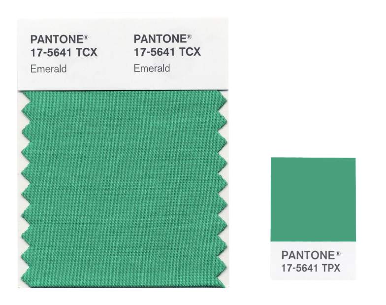
The verdict is in! Forget tangerine and zesty colours; according to Pantone, emerald green is the colour of year 2013.


Every year around September, Pantone releases a report announcing its next colour of the year. Over the past few years, Pantone’s announcements were vital to the development of trends in the fashion and design industries, as if their very survival depends on how religiously one follows Pantone’s commandments. Check out the colours for the previous five years below and you may find these tones mirrored everywhere in magazines and shop windows:


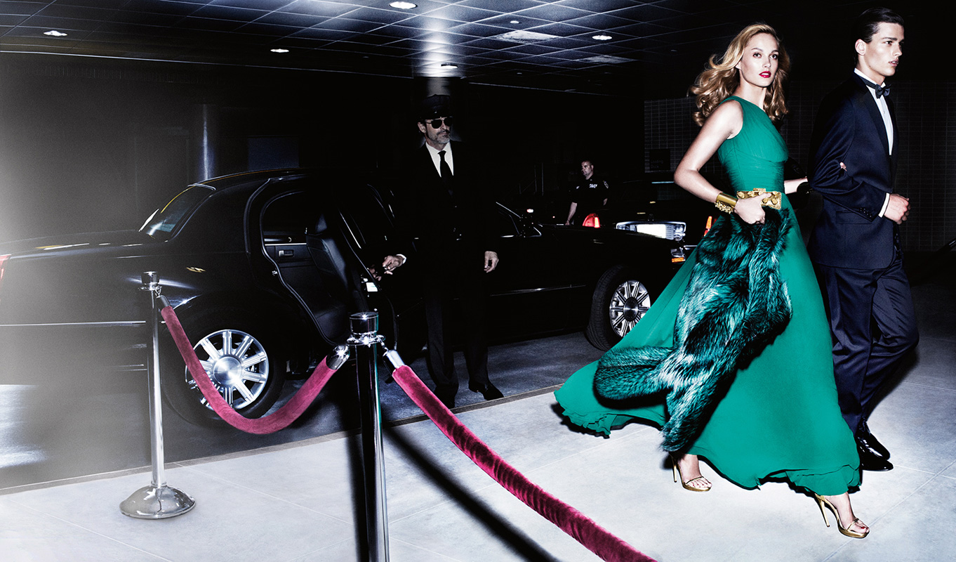
To be exact, Pantone’s colour for 2013 is called ” PANTONE 17-5641 Emerald” and is described by Pantone as a lively, radiant, lush green.
Personally, I’m not sure if I’m very fond of this choice. Emerald green is a great, vibrant colour, and would be a great colour for use in, say, interior design. The lush green gives a sense of harmony and rejuvenation, and hence would look great on a feature wall or even on furniture.
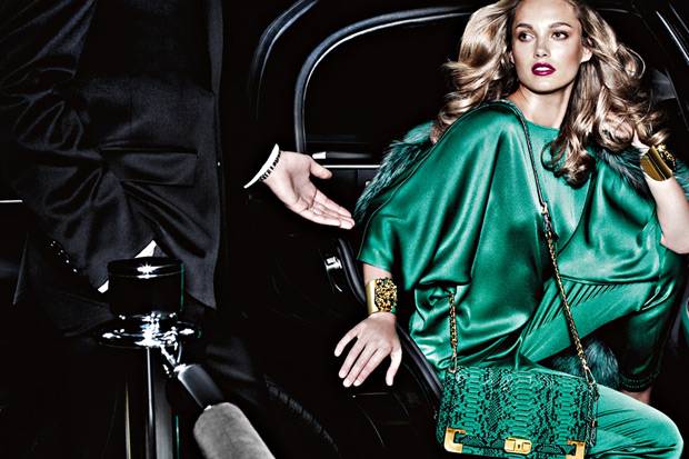
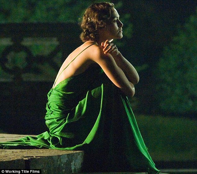
However, the story is quite different in the fashion world. There are so many traps to fall into when using this colour! It is a colour which can make you stand out and win you countless praise, like Keira Knightly in that gorgeous backless dress in Atonement:

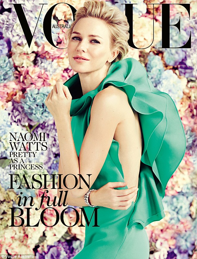
Naomi Watts looking stunning in emerald green against a backdrop of florals:

But on the other hand, if you have darker skin tone (this includes me), unfortunately, emerald green is not for you. Since it is quite a dark shade, it tends to weigh you down. Just check out how it turns J Lo to “Oh no”:

Picture from Candy and Couture
Check the pictures below – what on earth was Kim Kardashian wearing? Emerald green on suede? It makes sense if you are trying to look like your grandmother, as wearing emerald green on suede will make you look 100 years older:

Picture from glamazonsblog.com
In short, if you’re contemplating wearing emerald green, remember the following:
- fair-skinned ladies need only apply
- wear bright emerald green, avoid the darker shade;
- wear something with a shiny lustre, or sheer is good too
- the colour is darker than most bright colours so it tends to darken your skin tone
- wearing head to toe emerald green is a bit much, and a big risk. Wearing accessories in this tone is a good alternative if you feel the need to wear this colour
- the colour draws a lot of attention, so stick to neutral make-up and don’t wear red lipstick in case you want to look like a Christmas tree
For me, I think I’ll just stock up on emerald green accessories, just to add colour and variety to my outfit.


Bag from Burberry (burberry.com)


Trilby phoenix earrings
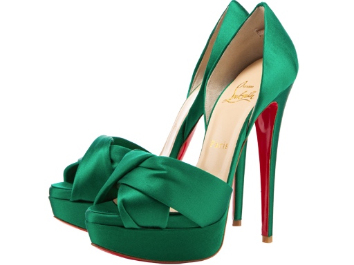

Christian Louboutin heels
What do you think? Is emerald green is a popular choice for the year? Do you think this year’s fashion will follow Pantone’s orders?

Pingback: Spotted: laces « Audrey's Day Out
Pingback: Spotted: Mother nature « Audrey's Day Out